The trend that emerges from existing data can easily be determined by adding a trend line to it. Microsoft Excel offers this tool. As such, it can show predict the general pattern and the overall direction of your data. Let us guide you through the steps add a trend line in Office Excel.
Add a trend line to an Excel spreadsheet
The trend line in Excel is a line that shows a general trend (up / down or up / down). Thus, it can assist in rapid interpretation of the data. The trendline in Excel can be added to a variety of charts, including bar charts, line charts, scatter plots, and more.
Let's quickly go through the process of-
- Creating a graph
- Adding a trend line
- Formatting a trendline
- Addition of a moving average line.
Please note that the steps in this article apply to Office 2019/2016/2013 versions.
1) Creation of a graph
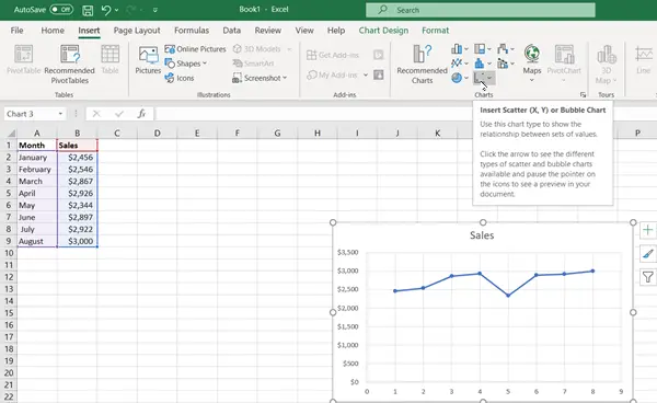
Enter the data for which you want to create a graph.
Then select the data and choose "InsertThe "tab.
Scroll down the category "Recommended graphicsAnd click on a chart to preview the data (if you don't see a chart you like, click All Charts to see all the types of charts available).
2) Adding a trend line
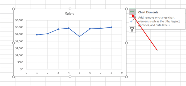
After creating a graph, select it and press the visible "+" icon next to the graph.

Scroll through the list of options and select ‘Trendline".
Click the side arrow to display more options and choose the desired option.
Please note that Excel displays the Trendline option only when you select a chart containing multiple data series without selecting a data series.
3) Formatting a trendline
Again, press the "+" sign, choose "Trendline", Scroll down and select"More options"
When the Format pane becomes visible, select the trendline option from the drop-down list.

By default, Excel inserts a linear trend line. However, you can add other variations of your choice like,
- Exponential
- Linear
- logarithmic
- Polynomial
- Power
- Moving average
Set a value in the Forward and Backward fields to project your data into the future. Formatting a trend line is a statistical way of measuring data.
4) Add a moving average line
If you want to format your trendline into a moving average line, you can do so. For that,
Click anywhere in the graph.

Go to ‘Format"And under its tab"Current selection", Select the trend line option from the drop down list.
Then click on "Format selection".

Then, from the format ‘Trendline"Shutter, under"Trend line options", Select Moving Average. Specify points if necessary. (Please note that the number of points in a moving average trend line is equal to the total number of points in the series minus the number you specify for the period).
This way you can add a trendline to an Excel chart and add more depth to its information.
